A Lean WordPress Home for Desk Advice
When readers arrive looking for a desk recommendation, they should not have to navigate a maze of popups and oversized feature grids. A clear article, an honest comparison, and an easy-to-find one-page Desk Audit signup do more for that visit than a pile of plugins. For a WordPress site, start with the parts that support those tasks.
Keep the Theme Simple
Kadence WP and GeneratePress both have free versions that work with WordPress’s block editor, making either a reasonable starting point for a straightforward editorial layout. Choose the one whose starter design is easiest to simplify into readable articles, comparison tables, and a visible signup form. No theme guarantees a particular PageSpeed score; image size, hosting, scripts, and page design all affect loading.
Build only the layouts the site needs. Kadence Blocks or GenerateBlocks can add callouts and comparison sections, but more block options are not automatically better. Keep the product details readers need—such as dimensions, hand orientation, and workspace considerations—easy to scan.
Choose Tools by Their Job
On Hostinger, LiteSpeed Cache may already be installed; check the dashboard and keep the configured plugin enabled unless you have a specific reason to change it. For search and social previews, Rank Math or SEOPress can handle common metadata needs. If Pinterest matters to your publishing plan, use the verification method in the plugin’s current settings rather than pasting code into an unrelated field.
A lightweight form tool such as Fluent Forms can collect signups for the Desk Audit PDF, with a direct integration or webhook to an email provider such as Kit, MailerLite, or Brevo. Pretty Links or ThirstyAffiliates can help organize affiliate URLs, but link management should never hide the fact that a link is an affiliate link. Add a clear disclosure near recommendations, and keep the signup form’s purpose plain.
Make the Next Step Obvious
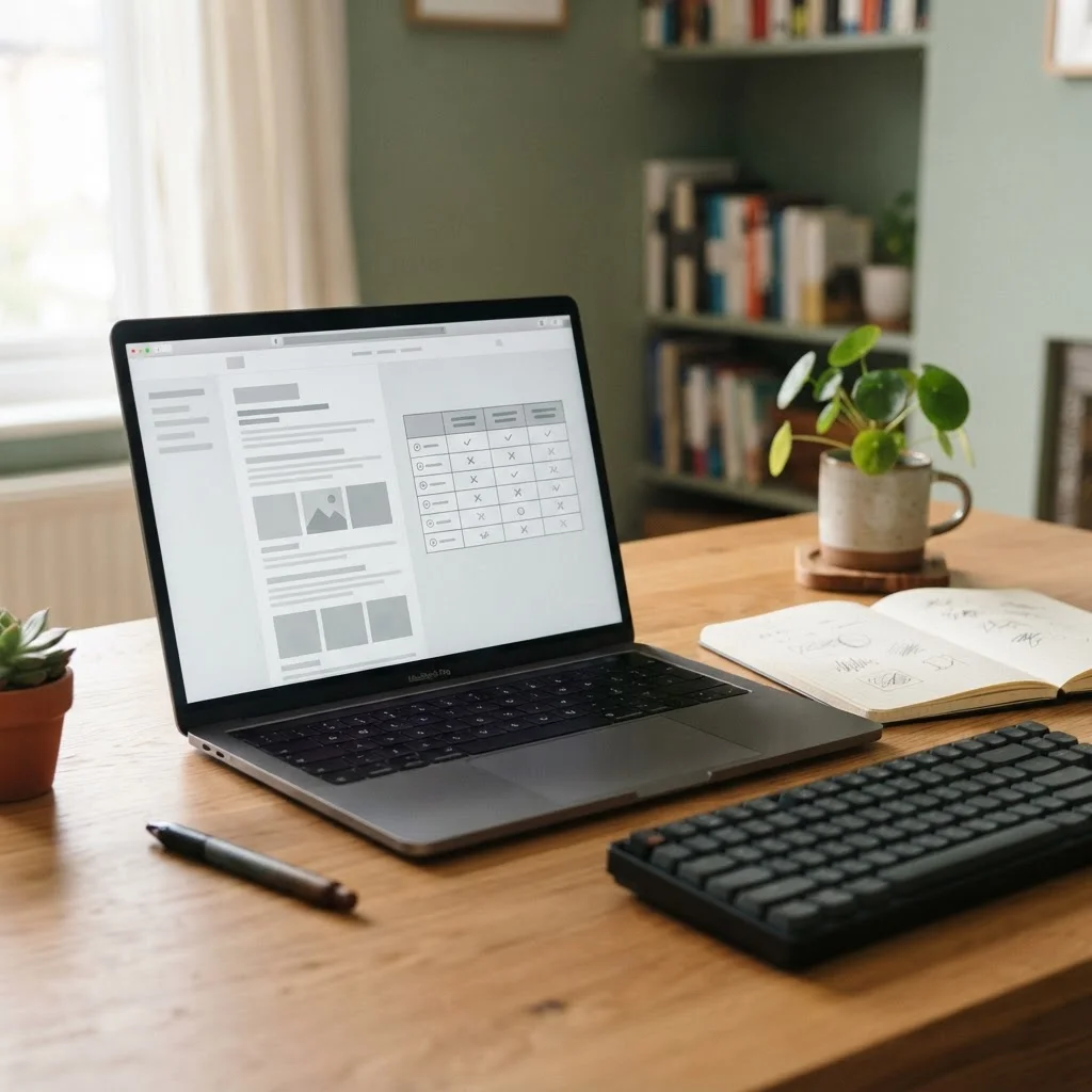
A reader comparing vertical mice should be able to find the useful distinctions without scrolling through unrelated promotions. A compact comparison table, brief notes about who each shape may suit, and a link to the Desk Audit can form a natural path through the site. Keep the page focused on helping someone decide whether a product fits their hand and workspace.
Test the site on a phone as well as a desktop: tables should remain readable, forms should be easy to complete, and images should not push the article out of view. The practical rule is simple: install a tool only when it has a clear job, and remove it if the site no longer needs that job done.